The Problem:
Current design has several problems, it's not been updated in 6 years, SEO is needs major upgrade to stay competitive within our market, the mobile view is not user friendly.
The new design must achieve those objectives while maintaining the existing style, existing branding, incorporating stakeholder requirements and improve usability.
Process:
1) Gathered stakeholder requirements, collect user feedback from Hotjar heat maps and surveys.
2) Created wireframes based on the above information gathered.
3) Created prototypes developed from wireframes.
4) Remote interviews were conducted with eight users: 2 corporate researcher, 2 professors, 4 post-graduate researchers. 7 of the eight had experience authoring journal papers. They focused on a variety of subject areas, STEM, Social sciences, Law, Environment, and Political science.
Users were asked to give feedback on the journal homepage design. They were asked to fulfill key tasks; find a specific article, a specific journal issue, aims and scope, journal metrics. Authors were also asked to find the instructions for authors, and where to submit a manuscript.
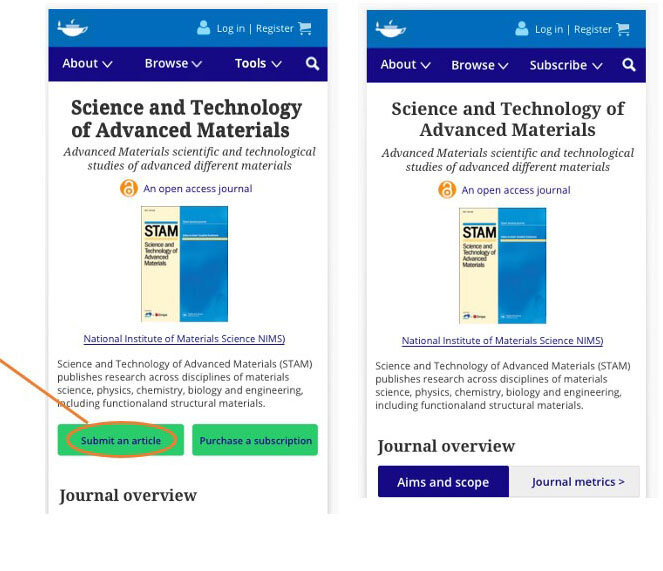
Desktop and mobile design before
link to implemented design
Research Results / Solutions:
“I think it’s quite nice. Though I don’t think I would use a mobile phone to submit/subscribe. I would probably use a mobile to search but not much more. ”
“Putting the major categories to publishing right in the middle and the contrast of the dark button right in the center is better. Love that it brings up latest article or current issue as that is where I often start.”
“Looks quite intuitive”
“Prefer the new one, a little bit better, everything in one place. It feels like the different sections are organized. ”
Objective / Outcomes
Determine user participant’s satisfaction with the new journal homepage layout - Average user rating was higher than the existing site design for both desktop and mobile prototypes.
Understand if there is an improved Researcher user journey for page-to-page navigation and on-site content discovery on the new design – 8 out 8 users found the page-to-page navigation more intuitive on the prototypes.
Understand if the new design leads to increased submissions and Researcher Services revenue stream – All users found the submit button and instructions for authors with no trouble, 4 out of the users found the submit button more quickly on the desktop prototype than the existing site design,
Understand if the new design improves the visibility of Society partners – 2 out of 8 users (unprompted) pointed to the Society partner’s section mentioning the social media links as important.
Understand if Authors can more easily achieve their objectives using the new design – Authors (7 out of 8 users we interviewed) had no trouble finding the author-related items on both desktop and mobile.
Understand if researchers can more easily achieve their objectives using the new design - 8 out of 8 users found the research flow more intuitive on the prototypes than the existing TFO design.
Understand if the new design helps researchers/authors discover other highly related and useful journals/books/articles that they weren't aware of before they visited and if those types of recommendations would be useful – 8 out of 8 users mentioned the related articles, new browse sections as being highly beneficial to their research discovery process.
Key Findings
Users had no major trouble navigating the existing journal homepage design
Users had no major trouble navigating the prototypes
Users liked the “sign-posting” on the desktop menu prototype (Publish with us, Explore etc)
The initial response to the new desktop design was neutral, but after exploring it all users said that it was more intuitive
All 8 the users responded very positively to the overall design of the mobile prototype
Users said they would not submit a manuscript on a mobile device, therefore the highly visible submit button on the mobile homepage was useless
Users did not like the title of the “Tools” menu on the mobile prototype but understood the functions available within the menu itself
Desktop Recommendation:
1.
Users had to scroll down to see the full ”About this journal” drop down and several users mentioned the top band being too busy
Recommendation: Minimize the journal title to create more visual space and give room to move up the menu so users don’t have to have to scroll down to see the full dropdown.
Mobile Recommendations:
2.
The first 4 users did not like “Tools”
We began testing the prototypes the first 4 users found the “Tools” title to be problematic. Midway we tried other menu title options. We decided on ”Subscribe” since we users didn’t want the section to include the submit option with the subscription options, thus making all the content under this button related to subscribing.
Recommendation :
Change the “Tools” section title to “Subscribe”
3.
4 of the 8 users did not think submission should be repeated on the “Tools” section
Users said that having submission information under tools or grouped with subscription options didn’t make sense to them in that section. That they would expect to find that information under ”About”
Recommendation: Remove ”Submission information” from section.
4.
3 of the 8 users mentioned the sections of the mobile needed to be more obvious compared the headings
Recommendation: Indent the buttons under the section headings
5.
8 out of 8 users do not submit manuscripts on mobile devices
5 of the users commented on the submit button as something they would not use on mobile.
Recommendation: Remove the submit and purchase subscription buttons. Having just the ”Purchase a subscription” button alone was visually overpowering, so we removed both. Make the ”Tools” menu option “Subscribe” to make up for removing the ”Purchase a subscription” button.
This project is being submitted to development 4/20/2021 and is not yet live on tandfonline.com


